Daycare Design Color Strategy: 7 Essential Lessons for Calmer Childcare Spaces
Daycare Design Color Strategy Starts With Intention
Daycare design color strategy is more than choosing cheerful paint. Color affects how a childcare space feels, how children move through it, how parents read the room, and how staff use it every day. A strong daycare design color strategy keeps the space playful without making it visually overwhelming.
Why Daycare Design Color Strategy Matters
Many daycare and preschool interiors use bright color everywhere because the goal is to feel fun. The problem is that too many competing colors can make a room feel busy. A thoughtful daycare design color strategy uses color to organize the space, support calm, and guide attention.
1. Begin With a Soft Base
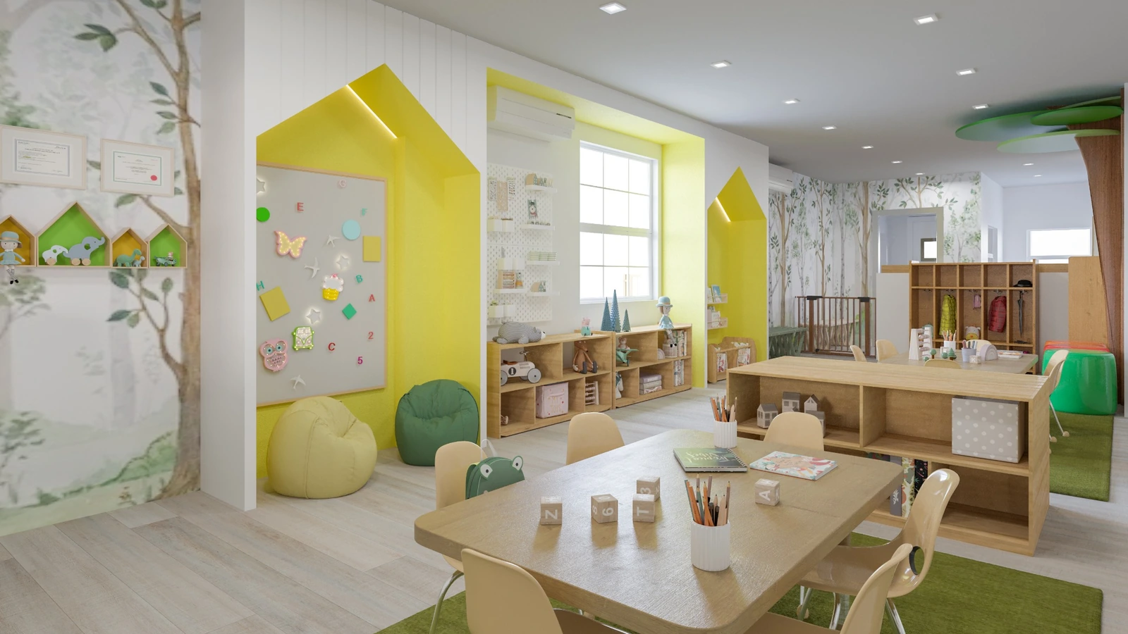
A calm base palette gives the room visual breathing space. Soft wall tones, light flooring, natural wood, and gentle patterns can make a childcare interior feel open and organized. This does not remove playfulness. It creates a foundation for color to work better.
2. Use Accent Colors Carefully
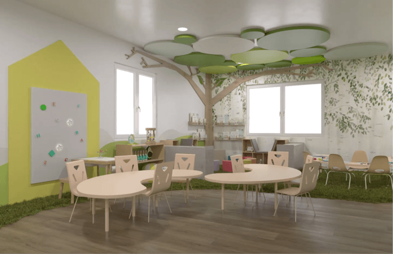
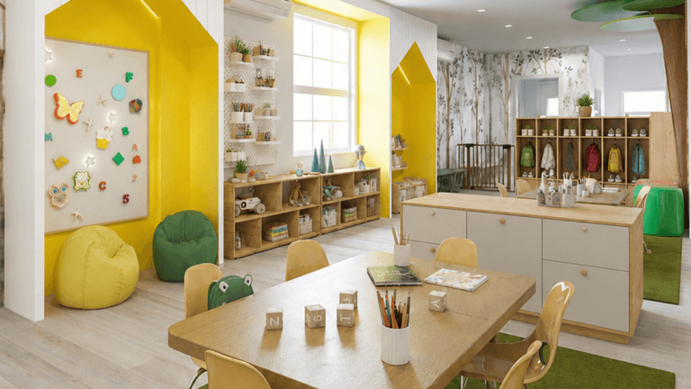
In Bright Smiles Childcare, yellow and green accents bring energy without taking over the whole room. A daycare design color strategy works best when accent colors highlight activity niches, learning areas, and memorable moments instead of covering every surface.
3. Let Color Define Zones
Color can help children and adults understand where activities happen. A yellow niche can signal a learning moment. A green rug can define a table area. A softer wall can support a calmer zone. Color becomes functional when it supports wayfinding and zoning.
4. Reduce Visual Noise
Good daycare design color strategy is not about removing joy. It is about removing unnecessary competition. Children can still have bright accents, playful furniture, and engaging materials, but the room should also include visual rest.
5. Build Parent Trust
Parents notice whether a childcare space feels clean, organized, safe, and thoughtful. A controlled palette can help the room feel professional while still feeling warm for children. Color strategy supports the first impression families carry with them.
6. Support Staff Routines
Staff use the space every day. Clear zones, organized storage, and visual order can support transitions, cleanup, and supervision. A daycare design color strategy should help the room function, not only decorate it.
7. Connect Color to Daily Care
A daycare is a daily-use environment. The CDC Early Care and Education Portal offers resources for early care providers supporting children’s health and well-being. Interior decisions should also support safety, cleaning, supervision, comfort, and the daily reality of childcare operations.
Bright Smiles Childcare Shows Color With Purpose
Bright Smiles Childcare uses soft natural tones with controlled yellow and green accents. The room feels cheerful, but it does not feel visually loud. This is the difference between random decoration and a daycare design color strategy.
Planning a Daycare Design Color Strategy
Daycare design color strategy should begin with the experience you want children, parents, and staff to have. Before choosing colors, think about flow, zones, storage, supervision, cleaning, and brand identity. Then let the palette support those goals. The strongest childcare interiors feel playful, calm, trustworthy, and functional at the same time.
How to Apply Daycare Design Color Strategy in a Real Childcare Room
A strong daycare design color strategy begins with the room’s purpose. A classroom, nap area, reading corner, activity table zone, entry area, and storage wall may each need a different level of visual energy. Start by deciding where children should feel focused, where they should feel active, and where the room should feel calm. Then choose colors that support those moments. This makes color part of the daycare’s function instead of a surface-level decoration.
Daycare Design Color Strategy Checklist for Owners
Before finalizing a palette, check whether the color plan supports zoning, parent trust, staff routines, cleaning, and brand identity. Are accent colors used in the most important places? Does the room still have visual rest? Do rugs, walls, furniture, storage, and activity areas feel connected? A practical daycare design color strategy helps the childcare space feel cheerful without feeling overwhelming. That balance is what makes the design easier to use every day.
Featured Project: Bright Smile Childcare
Planning a Daycare or Preschool Space?
If you are planning a daycare, preschool, childcare center, or child-centered commercial space, start with the experience you want families and staff to have. Then let the color strategy support that experience. A thoughtful palette can make the space feel playful, calm, professional, and memorable at the same time.